ShopDreamUp AI ArtDreamUp
Deviation Actions


Description
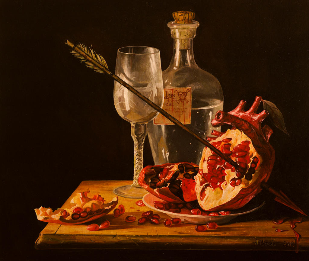
oil painting 53 x 45 cm
it's birth has a funny twisted story...I had received a message from MarkScheider, that has made a photo after one of my still life paintings, [link] .. I browse his deviation folder and I was really inspired by his pomegranate photo [link] so I came to paint this one...
see my other paintings


it's birth has a funny twisted story...I had received a message from MarkScheider, that has made a photo after one of my still life paintings, [link] .. I browse his deviation folder and I was really inspired by his pomegranate photo [link] so I came to paint this one...
see my other paintings
Image size
3593x3029px 7.78 MB
Make
Canon
Model
Canon EOS 550D
Shutter Speed
1/2 second
Aperture
F/4.0
Focal Length
50 mm
ISO Speed
100
Date Taken
Jan 28, 2012, 8:49:05 PM
Sensor Size
15mm
© 2012 - 2024 borda
Comments234
Join the community to add your comment. Already a deviant? Log In
I must admit, this is a really good concept. I really like the chiaroscuro effect you used to create depth into the painting. I also quite enjoy the idea of the heart and pomegranate, it really adds originality to the piece. Although, I believe the technique could have been initiated better.
First off, the composition doesn't seem right to me. In my opinion, I believe the painting would have looked better visually if the arrow wasn't there. Don't get me wrong, that idea was a good one and I really do like it, I simply disagree with how it works into the painting. It does not flow. I could be wrong on how you wanted this painting to work, and if it's because you wanted the abruptness of the arrow in composition to be a visual metaphor of the abruptness of a heart break, then I would suggest something a little stronger. For instance, if you omitted the objects in the background, centered the pomegranate and properly highlighted the arrow, it would create a clearer and more effective impact.
Furthermore, I would like to point out how much of a great painter you are. Your use of color is impressive to say the least, and I love your realistic style. Although, I would be careful with the modeling of your wine glass and corked bottle. The circle at the rim of the glass doesn't match the circle of the bottom. Along with the slightly lifted left edge of the rim, the wine glass looks kind of wonky. This is a hard detail to get a hang of (I have a lot of trouble with it too). On that same note, you might want to practice using your paint brush as a center guideline to straighten out your form. I don't know if you do use this technique, but I noticed that the wine glass slightly leans to the left. That detail is really minimal and if I didn't check it out with my own pencil, I wouldn't have noticed it at all. I would also point out that the label on your bottle is way too flat. I would suggest paying close attention to labeled cylinder objects, because you'll notice that the label curves with the curvature on the object. This detail would really strengthen the form of the bottle instead of flattening it.
Either way, this is still a powerful piece and I really love the concept. I'm in absolute awe of your skills, and I especially love the intricate detailing you put into the objects. Especially the cutting board. Absolutely beautiful! <img src="e.deviantart.net/emoticons/s/s…" width="15" height="15" alt="
-Janique
P.S. I love pomegranates!